Showing posts with label Visual Arts. Show all posts

Tuesday, 12 April 2016

Visual Arts, Whale kid speed painting

For Visual Arts we were tasked with doing a speed painting for an existing drawing of a whale kid. 

Here is the original drawing: 


Below is my attempt at copying the drawing with the time I had in class.


Personal Work, Gladus in flight

For a short while I was heavily into Star Citizen after obtaining a new ship for the game, and seeing how I was starting to get into landscape drawing, I thought it would be cool to make some Star Citizen themed art. 


To start off the drawing I used a screenshot of the ship that I took in game, and then started to add stuff into the background. At first I wanted to add an aurora boreallas onto the planet down below, but instead I decided against it as it would steal too much of the limelight away from the ship itself. 
I ended up adding a city instead, using images of Europe from space found on google, because I thought it would be a great way to play around with the lighting in the photo. In the end I was quite happy with the result to be honest.


Visual Design, Insect drawing

One of our homeworks for Visual Design we had to design and draw an insect character with human features. 


As usual, I started off by drawing a few crude character designs in my sktechbook before starting on the real thing.  

One thing I wanted to make sure I did with the design was to have a nice stylistic twist. At the time I was heavily into the art of Fallout 4, and the aesthetics of the game. One thing that always caught my eye when playing the game was the unique collectible comic books that the player could pick up throughout the game.

Same


Using these comics as inspiration, I set out to make a character that would look like something that would appear on a comic book cover. Seeing as one of my sketches was a character in a vest, I thought it would be funny to make a comic book cover that referenced Die hard.

Instead of showing my process step by step, I thought  it would just be easier to post a gif that showed each stage of the image as it was developed.


As I started out drawing the character I thought  it would  be cool to make him half lobster and half human. But after doing much work on it I realized that he looked too similar to ZoidBerg from Futurma. Because of this I changed him to have features of an ant. In the end I was happy with the outcome seeing as drawing characters was not my best skill. 

Monday, 11 April 2016

Visual Arts, Spaceship Assignment

This homework was quite fun actually.


For Visual Arts we were tasked with doing a paint over drawing of a 3D model that we made. The only catch was that we had to make the model of a spaceship.

Okay so I didn't do the right thing and save my project as different files as I went though versions of it. But, but but but, I can tell you how I started it off.

First off I started drawing some crude spaceships on paper, these would serve as the basis for the main design.


The first thing I thought of was to make a space drawing with a desert planet as the main setting. I started scouring the internet for photos of the middle east from space. In the end I found a fantastic photo of the Red Sea from space.


After I found the photo I wanted I then went about making the model. For the ship design I decided to look at games such as Star Citizen for inspiration. One of the ships, that I loved the design of very much, was the main inspiration of the ship design. 
The Gladius, which honestly is my favorite fighter in the game, was chosen to be modeled off of.

Behold, the Gladius.

For the ship model I didn't go all out with detail, I mean this was a draw over task so detail in 3D modelling wasn't needed.
Most of my attention was focused on the back of the ship, as I wanted it to be viewed from behind in the concept art. 
As you can see from the back I tried to get the wings and fins to match the game model.
I also paid attention to the front of the ship, as I could use renders from different angles to add more ships to the photo. 

Look at that low polly spaceship.
Annnd after that I was done. Now to add it to the photo.

Okay so I saved over lots of my progress, so I'll have to just say what I did and you'll have to believe me. 

Explosions

So what I wanted to try and capture was a space battle of sorts happening over a planet. I mean this would be cool if I could pull it off. For the first thing I did I imported a render of the ship and then started drawing over it with the brush tool to give it a paint job. After that I then added the engine effect onto the back of the ship. 

As well as this I also imported another ship model that I made in my spare time, to act as a carrier ship or something that took heavy damage, and was causing wreckage to rain down on the planet below. 
Oh I also had to give the planet some detail so I could make it look like the ships were actually fighting over something. I mean this wasn't Homeworld. For this I added a city that I found on google onto the edge of the sea, and added smoke and fire effects to it.

More explosions and spaceships.

For the next iteration of the image I changed the position of the carrier ship and added a new ship in the bottom left corner. Also I took a photo of Bagdad from space and added it onto the photo on the right hand side. 
Also there were more little details added to the image, like more smoke from the city, and ships in the scene. 

For the final iteration of the image, I thought the spaceship could use more detail, so I added some rust and grime effects onto it and improved the engine effects to give it a sense of movement. 


Visual Arts, House composition drawing

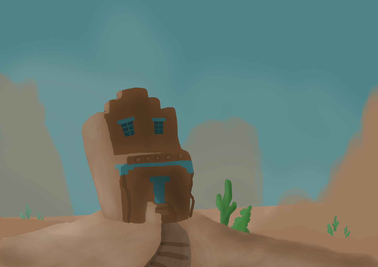
For visual arts we were tasked with doing a speed paint drawing of a house image to test out composition. Below is  the image we had to copy, while even further down is my terrible attempt at it. 

Original drawing. 


And here is my attempt at the image.


Sunday, 10 April 2016

Visual Arts, Tree with character

For Visual Arts we were tasked with drawing a Tree with character. Not character as in life like, but as in it game off some sort of setting.

For my tree I decided to draw something dark, brooding and spooky. Like something out of the plaugelands from World of Warcraft. 

2Spooky4me


Also, looking at real life examples I drew more inspiration for the drawing itself.


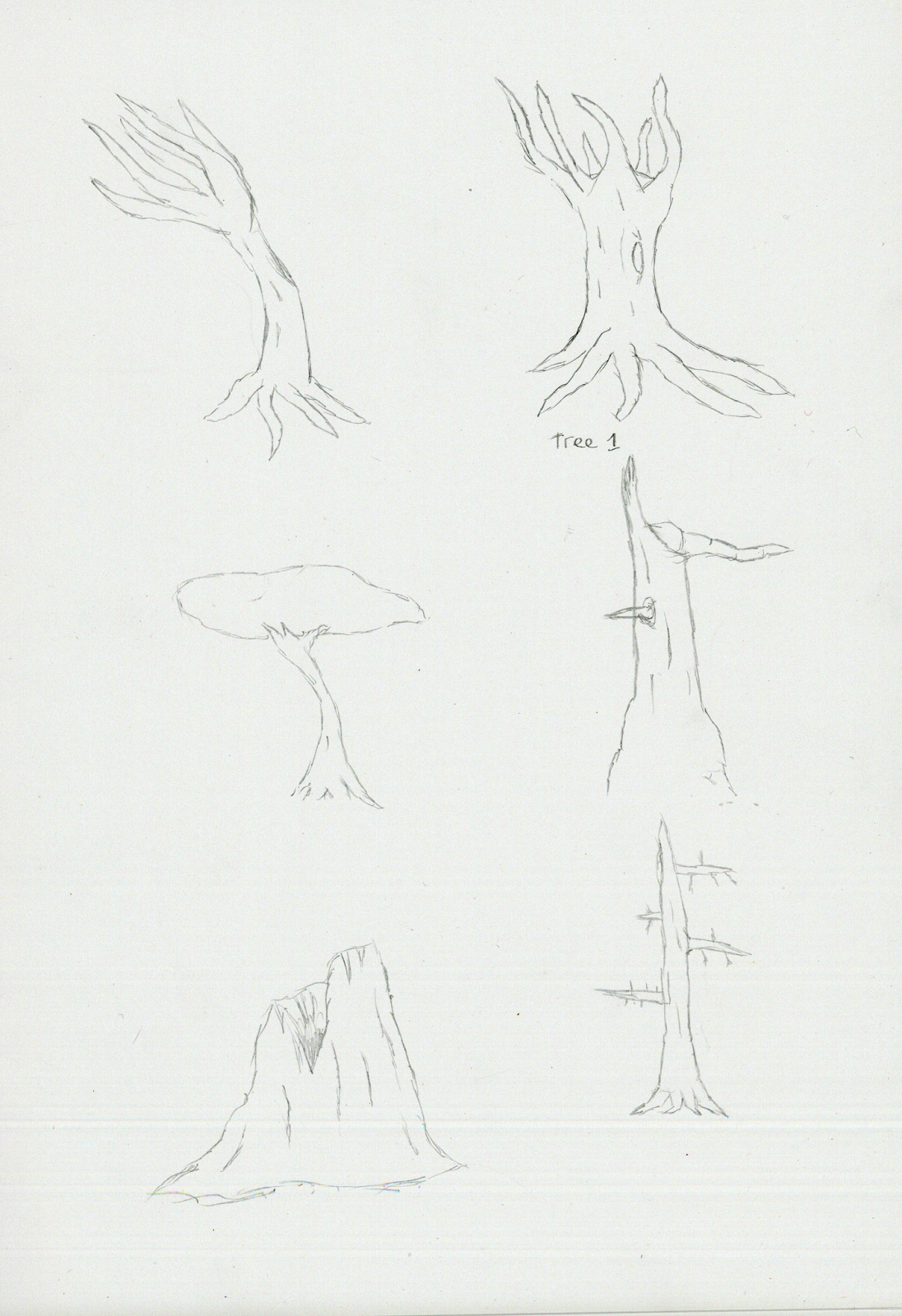
I drew some concepts of trees I could use on paper, before choosing the final tree for the Photoshop design.


This is the tree I ended up with, I wanted the main colour to be green, so, I made most of the colors in the image green. Didn't see that coming.

Another landscape drawing, because landscape drawings are love. 
Looking back at the drawing I think it could be improved more, but honestly I'm not sure how. 

Friday, 1 April 2016

Beep Boop

Found a cool swamp like area while I was taking a break playing Fallout 4, the area inspired me to make some concept art out of it.


The swamp like area from above, exploring it was really immersive. 


I actually made a gif of my progress this time, It's quite cool to see how far I came from when I first started. 


At first I wasn't quite sure what to draw along with the swamp, but I decided to draw one of the Protecterons in the game, which by far are my favorite robot design. 


First I started with the robot drawing by copying images that were already in the game, after that I then enlarged the canvas. 


After this was done I played around with the colors of the scene in the background, ground and an outline of potential clouds were added. I also made custom brushes for this drawing by cutting out trees that I took screenshots of in game. Lighting was also added to the robot by using the burn and dodge tool.


Next the position and size of the robot was changed, along with the lighting. Also clouds and a background was added into the scene.


Also more foliage was added to the foreground, and more dead trees.


Still unhappy with the lighting on the robot I changed it again to make the photo have a more darker tone, glow was also added to the light on the robot. Moss and branches were added in too.


Now we add more trees yet again, move the mountain in the background, and add rain to the scene. Shadows on the robot were also improved to help give it shape, along with wires were its arm used to be.


Tone down the rain a tiiiny bit, also add some fog to the scene for extra spookyness. Rain splashes were added to the robot and the floor in the scene.


More branches and stuff.


Fog improvements, as well as the ground being changed to make it look more like a swamp.


Wetness effect added to the robot to make it look like it was actually in the rain.


Final Image. More wetness effects added to the image, shininess was also added too.


Friday, 25 March 2016

Personal work, B17 concept art

This one just really came out of the blue when I was bored one night. 

Behold, the process of making the final image.
First we start with a photo of two sassy bombers from the internet.


Then we cut the bomber in the background out and add some hue to the image to change the color, as well as a background to match the tone. 


Then we fuck up by saving over 30 minutes of progress so we can't go back to show how it was done.


Add some fancy prototype Horten ho 229's, because Bf109's are so 1942, and some more US planes to the scene, maybe even start to add some trails in to help give off the illusion of speed. 


Pushed the fighters into the background and add a bit of color to them to make it seem like they are further away, made the tail of the front bomber look like it took damage. Remove the out of place smoke effect at the bottom. Also add a smoke trail to a B17 in the photo, because it is important to show one B17 getting shot down when depicting a B17 bomber group in any form of media. 


Then I thought the burning bomber was stealing the limelight from the bomber in the foreground, so I moved it away a bit. Oh and also added a bit of color to make it look like it was in the distance. also I removed the terrible flak effects that littered the photo.


I wanted to then add two things, color to the image to make it look like light was coming in from the left side of the photo, and vapour trails to make it seem like there was a dogfight going on in the photo.


The clouds were then changed to match the lighting in the photo, also details on the foreground bomber were changed to give it some personality. Also changed the color of the pilots shirt to match that of bomber pilots of the time. 


The color of the clouds was also changed to match the background.


Also the nose art on the foreground bomber was finished off, snazzy.


Finally I added shadow to the bomber in the image to help it look like sun was coming from the left side, also some propeller blades were added that were missing. Ta-da!